
WARNING:
Painful Embarrassment for the Author ahead.
I once had a marvelous idea. (I know – I was shocked too). I had an image of a book. What, thought I, could be better than using a picture of a book and using it as the front cover of my book? It could be genius. Right? Right?!!
In a more professional person’s hands, why yes – yes, it could.
In mine?
No.

1. Don’t have grand ideas. Grand ideas are often bad ideas. Stick to your skill set.
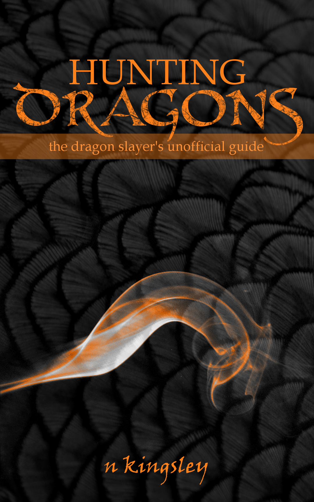
So I moved on. To below. Candle flame and [for the sake of designer mystic, I shall not reveal what the scales are. They are not dragon scales, let me tell you that. Or are they?]. Much better? All it took was a little shifting about of two images, colouring, font etc. But it didn’t feel right. And, you know, that ‘a’ is kind of unsightly.
But then, I realised something – ‘How to Hunt a Dragon’ sounded a little too close to ‘How To Train Your Dragon’. Now, I have no great ambitions to plagiarism, so I decided to scrap that title. And add a little something extra.
2. Don’t choose a flawed title and decide to change it half-way through. If you dislike headaches and wish to avoid them, by all means, consider the repercussions of your title.
Ahem. The title changed.
 … but, it didn’t look right. And besides, I really, really needed that background for another project – that of a trilogy which will be appearing soon. (And by ‘soon’ I mean ‘in a year or so’ – slow and steady wins the race and all that).
And so it was back to the drawing board. For the sake of my (already) bruised pride, I shall not show you the sketching in my notebook. I have great ambitions to be the next Da Vinci, but alas! reality does not support them.
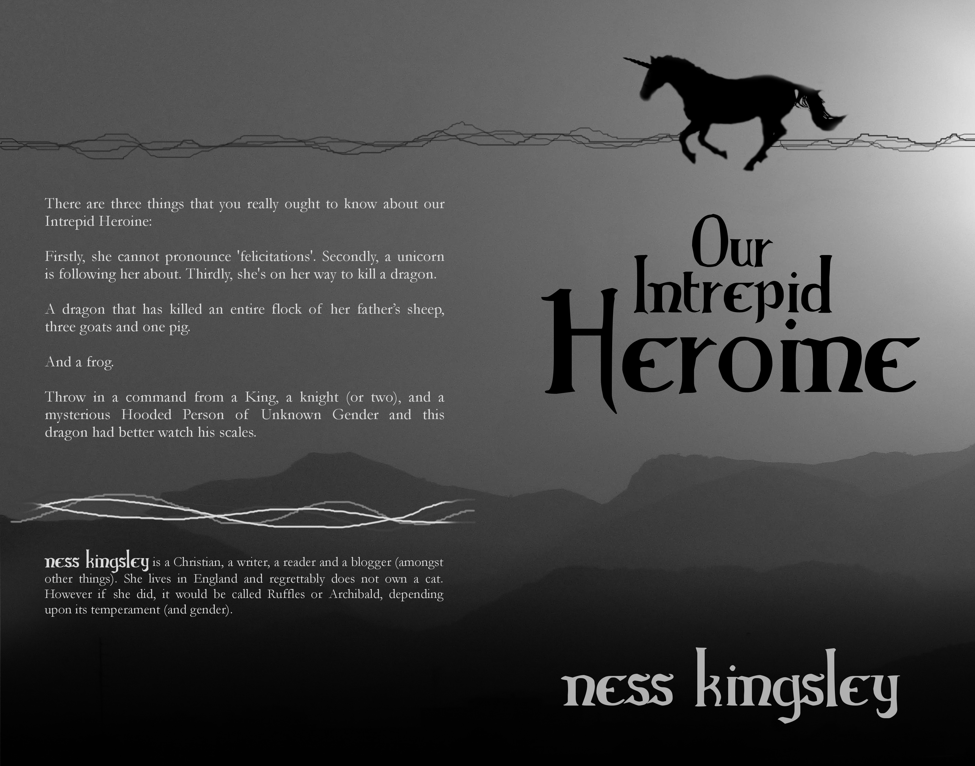
What I can show you is sketch that I drew up on a tablet:

New title, completely different design. A very ambitious design. Do you see that cliff in the background? Yes. Well, that isn’t there anymore. I refer to Lesson 1 – don’t go above your skill set (and cache of available material).
Another fact which you may not know: putting a horn on a horse is very difficult thing.
3. Don’t put horns on horses. It’s bad for your mental health.

So – you’ve finally finished. You’ve go that front cover ready and waiting to be released. People are going to be holding this miraculous thing in their hands …
Wait. You wanted to design a front cover for a print book?
Oooohhhh.
4. An ebook cover and a print book cover are two different things. One is reasonably simple. The other is fiendish and should (preferably) be designed first.
Yes. You’re probably going to have to fiddle about for a bit. You know; readjust the size of your cover, make the cover flow into the back cover. Get the blurb on the back. Make sure that the blurb isn’t too big or too small. You know – the usual.
[Not Pictured: The Intense Frustration and Headaches this can cause]
But you know what? It’s worth it in the end. Unless, of course, you decide to dip into your bank account and hire a professional.
That could work too.
5. Go with the option you are most comfortable with.
7. Patience is a virtue. You’ll be feeling very virtuous by the end of it.
and finally:
8. Be willing to invest plenty of time into your project, and be ready to play about a lot.


Whichever way you chose, I wish you great success, few headaches and a wonderous final result. (But I really mean it about putting a unicorn’s horn on a horse).

Haha, so awesome!!! And I must congratulate you; I had no clue that the horn wasn’t already on the horse. *applauds* The cover for my book was ridiculously easy – everything just fell into place. 😉
Thank you. It was … haha, quite an interesting experience, that’s for sure. Congrats on that! It’s wonderful when cogs mesh smoothly. Double congrats, for I believe it is a certain person’s certain blog anniversary? 🙂
Oh yes, cover designing always is. Covers never turn out the way you think they will. I thought I’d have a volleyball on mine. XD
*blushes* Yes, it is! Thank you!
But somehow it always works out, I’ve found. You have to shed a few ideas along the way though.
You’re very welcome 😀
Oh yes. 😉